Revamp product of EzyCargo
UX/UI Design(Solo), Branding, Prototyping, Research
Feb 2022 - Jan 2023
Project Background
Global Logistics System HK Ltd (known as GLSHK) plays a major role in the e-freight development and enable different stakeholders in the air cargo journey. In this project, I was helping GLSHK to revamp the product called “EzyCargo” and build a new function called “Click & Ship Shopping Platform” by crafting user research, analysis competitor, building persona...etc
My Design Process
Better Understanding
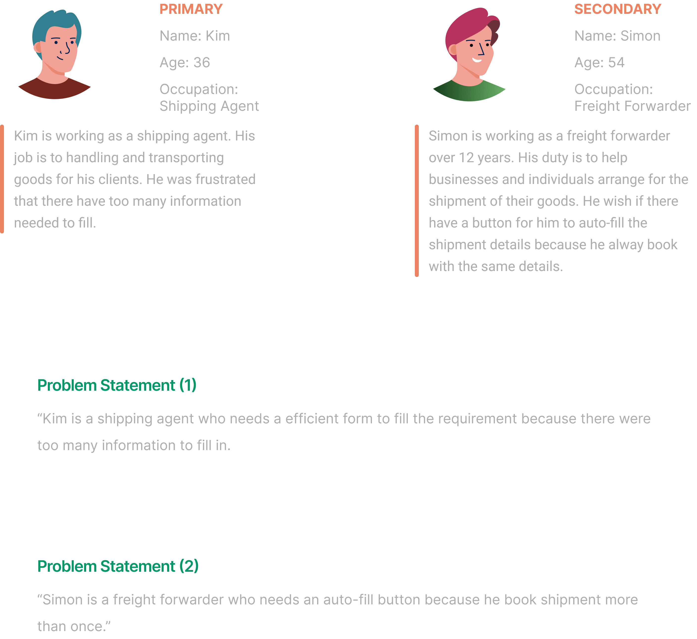
To find out more information from “EzyCargo”, I started experiencing through the product like an agent by follow the procedure to create a shipment. Here some questions to identify the problems: 1. Who is the target audience for the product, and how will the revamping effort aim to engage with them? 2. What information do I need for making a cargo shipment? 3. What type of information do people looking for?
Summery Of My Discovery
The following were what I found about the problem inside “EzyCargo” from surface to functions.
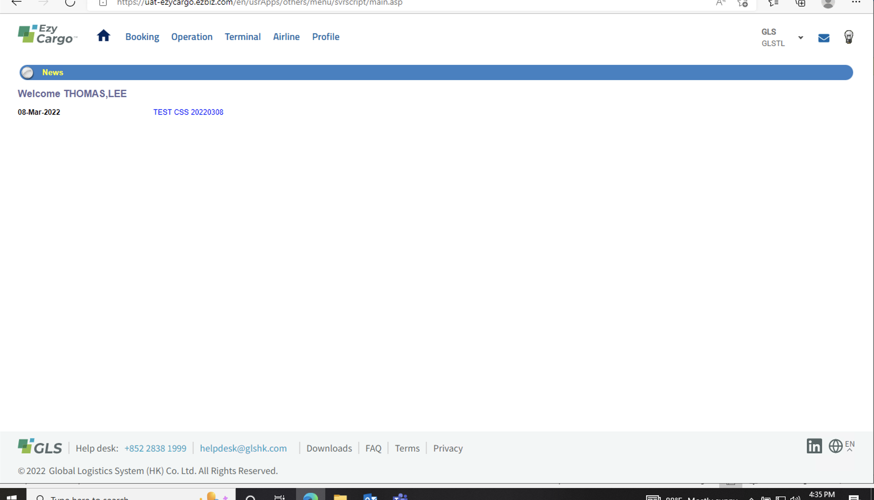
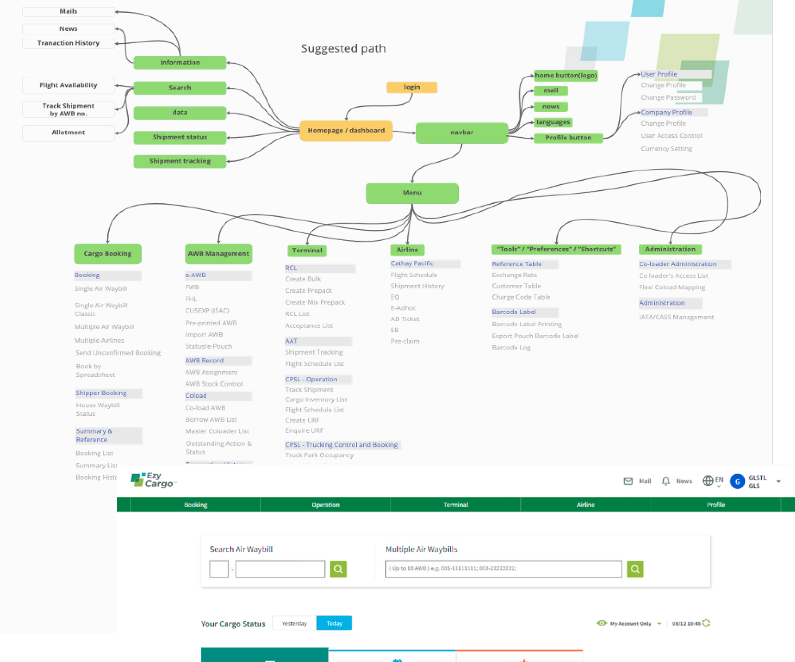
Confusing navigation bar structure:
After built a site map, there had some conflict inside the navigation bar that cause confusion for users. Example: Logo button and “Home” icon show at the same time, but returned different pages as a result.
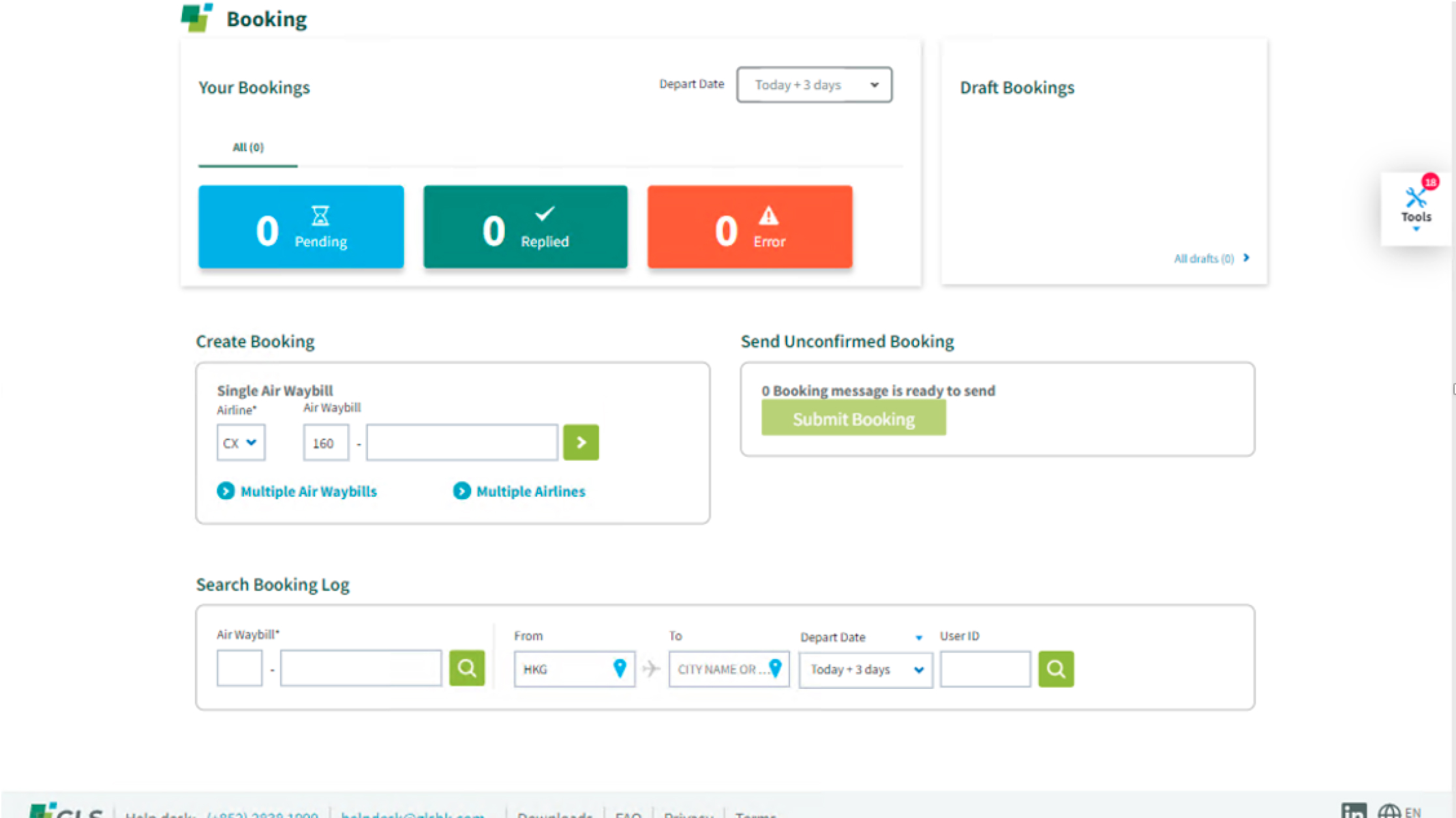
Limited data integration of Dashboard:
Dashboard with limited data integration can be a major hindrance for businesses that rely on data analysis for decision making. The exited dashboard in “EzyCargo” did not have its ability to provide a comprehensive overview of the data.
Building GLS Shopping Platform:
The exited shopping platform which GLSHK was working for Cathay Pacific. All the set up was based on CX Cargo requirement. And GLSHK want their own “Shopping Platform” which allow them recruit new users and airlines to use.
Conduct usability study:
Follow up to create “GLS Shopping Platform”, after collected the shipping details that needed for booking. I created a prototype and tested it out by conducting a moderated usability study which interviewed with colleagues and actual users.
Define
In this phase, I made the problem statement for creating “GLS Shopping Platform”.
Meet Our Users
Design
To completed the design phase, I given my ideation based on the research I found.
Revamp navigation bar
To make a better navigation bar, first I reconstructed the site map (filter out what need inside the “navbar” e.g. logo as home button instead “home” icon). Next, I set up “navbar” with two layers, on top it’s about “logo”, user function such as “profile”, “mail” & “news”; bottom are about product functions.
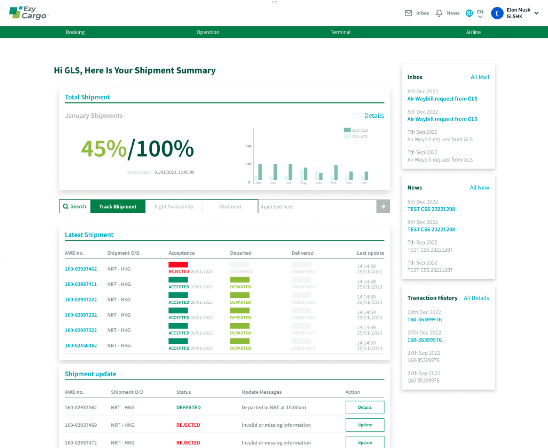
A data accuracy dashboard
To determine what information need to be display inside the dashboard. I designed a dashboard that provides a comprehensive data and metrics such as “Monthly shipment” and “Annual Shipment”. It designed to be easy to navigate with clear and concise visualizations that help users quickly understand key information.
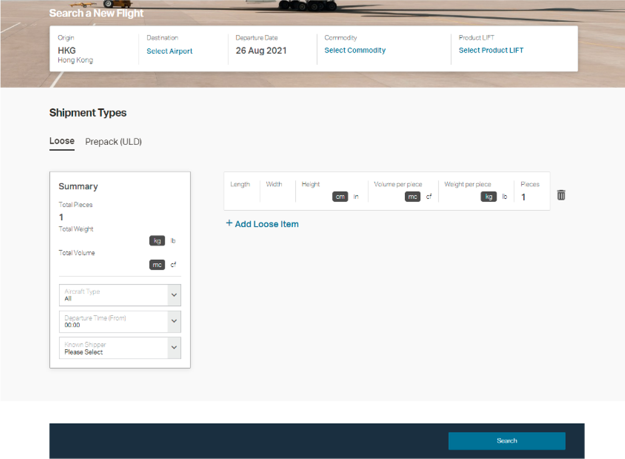
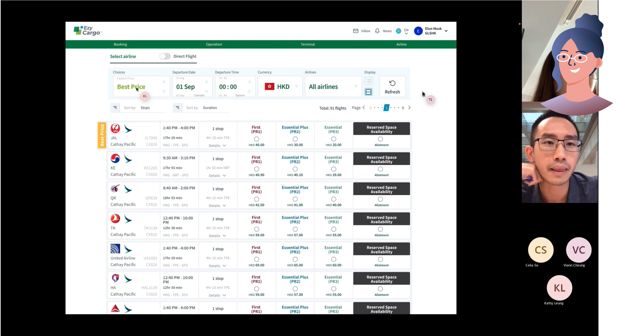
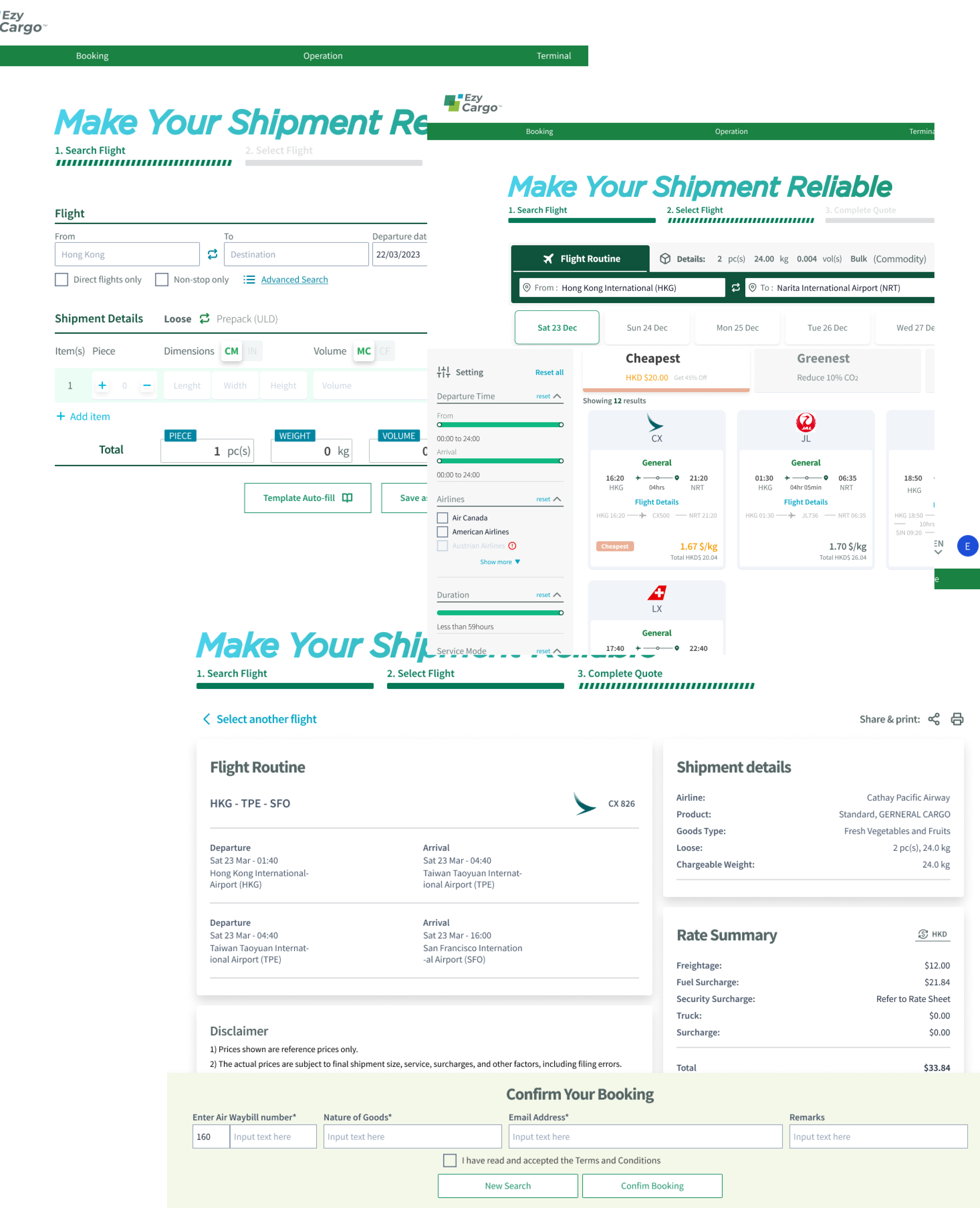
GLS Shopping Platform Prototype
After summarized the result from usability study, I made some changes for on the prototype. In step 1 “search flight” by input shipment details, more than 68% of interviewees experienced “auto-fill” button by uploading Excel file and admit that was efficient for their work. In step 2 “select flight”,I found people were getting upset when have to scroll back to top and edit their setting. Then the filter menu I put on the top changed to the left hand side. In the last step “purchase”, the highlight from the feedback that agents were mostly not prefer to show the price when sending out the quotation. And we provided an options allowed them not to show.
Takeaway / Outcome
The desired outcome of creating “GLS Shopping Platform” is to create a better user flow when booking a shipment. At the end, after the first round of usability study. I found out some details features are the game changers such as auto-fill by uploading Excel file or document, and given an options for agents to show or not showing the price. In the end, after tested out the mock up, “GLS Shopping Platform” was starting the implementation by development team.