Corporate Website & Product Web Portal Design
UX/UI Design(Solo), Web Design, Branding, Research
Feb 2022 - Jan 2023
Project Background
Global Logistics System HK Ltd (known as GLSHK) plays a major role in the e-freight development and enable different stakeholders in the air cargo journey. My tasks were helping GLSHK for their rebranding journey to re-design corporate website and enhance UI & UX for their products web portal.
My Design Process
Better Understanding
To Discover what GLSHK should present their new image to their audiences. Before I am getting started, I need a better understanding (like 79%) of GLSHK. My major questions to identify the problems: 1. Who is the target audience for the brand, and how will the rebranding effort aim to engage with them? 2. How will the rebranding effort be communicated to stakeholders, including employees, customers and the general public? 3. What are the goals and objectives of the rebranding effort?
Summary of My Discovery:
After checked out website & products’ web portal, I summarized what I discovered.
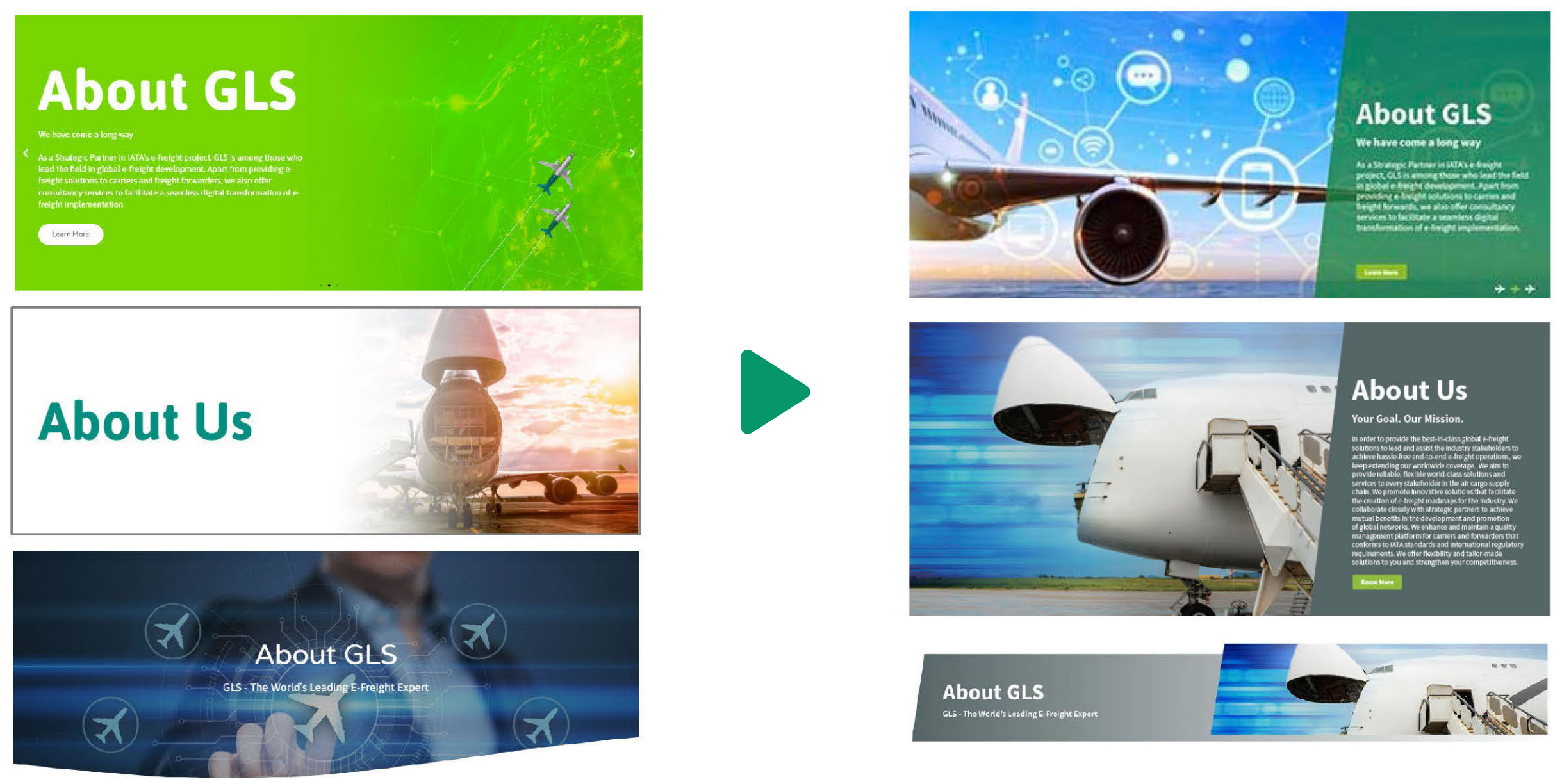
Poor use of visuals:
Images & graphics, are making the hero section feel un-engaging and unappealing.

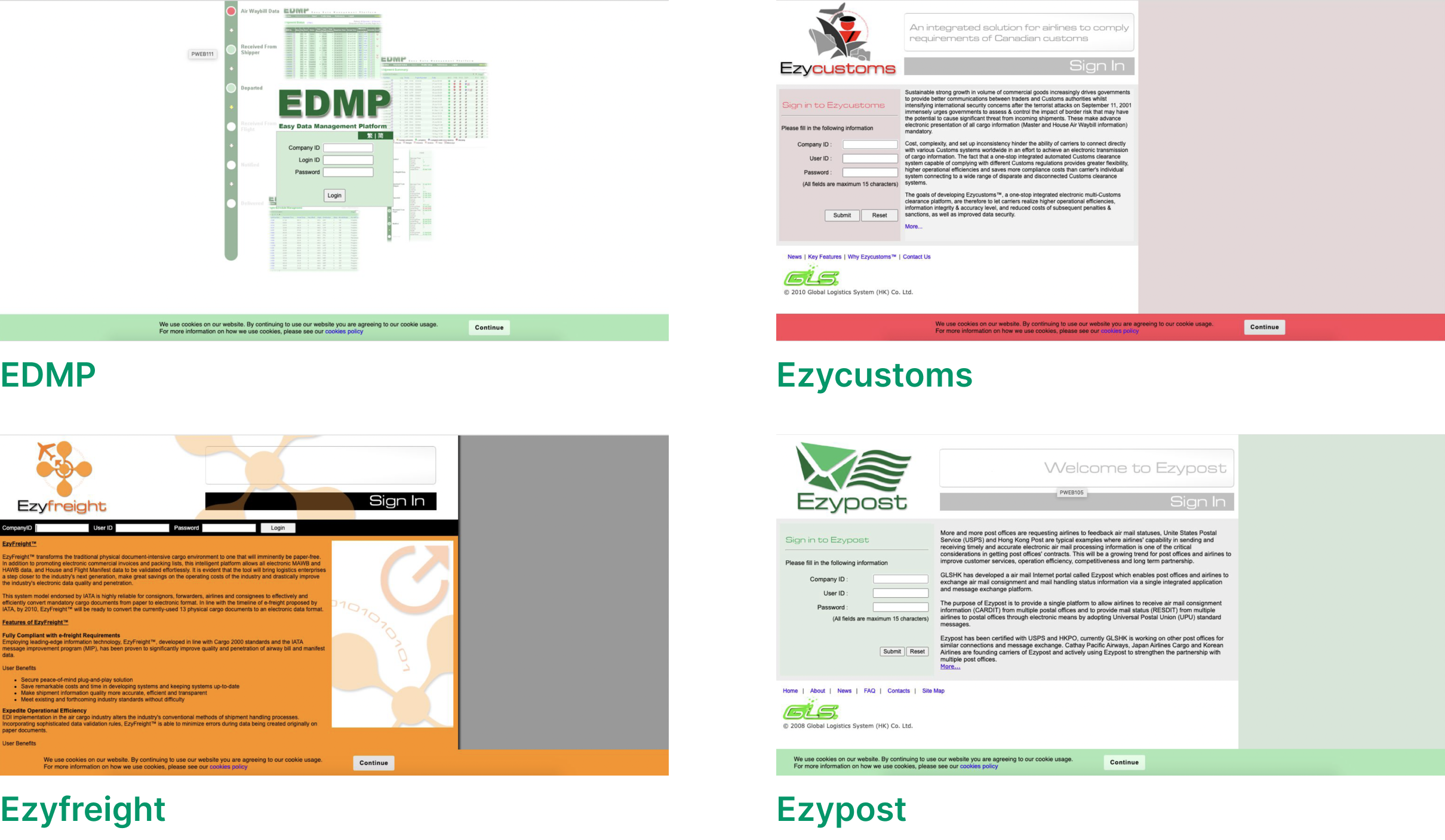
Lack of brand consistency:
Inside GLSHK "Ezysuite" products', there had 5 different products. And each of them have there own color theme.
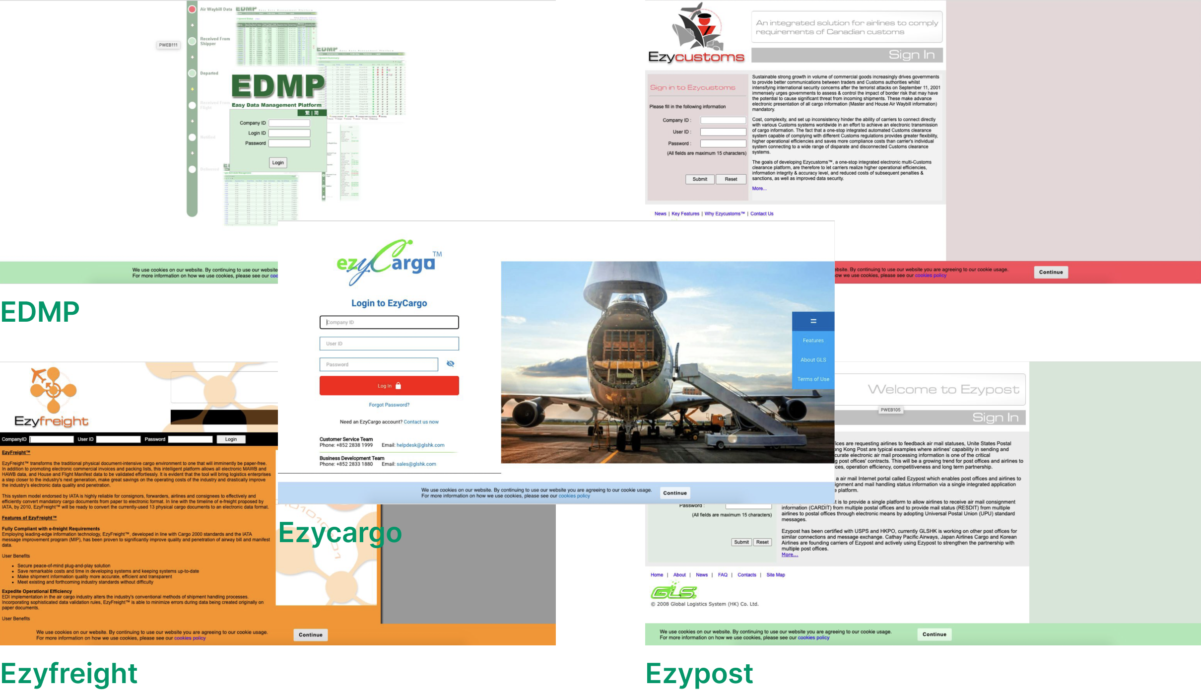
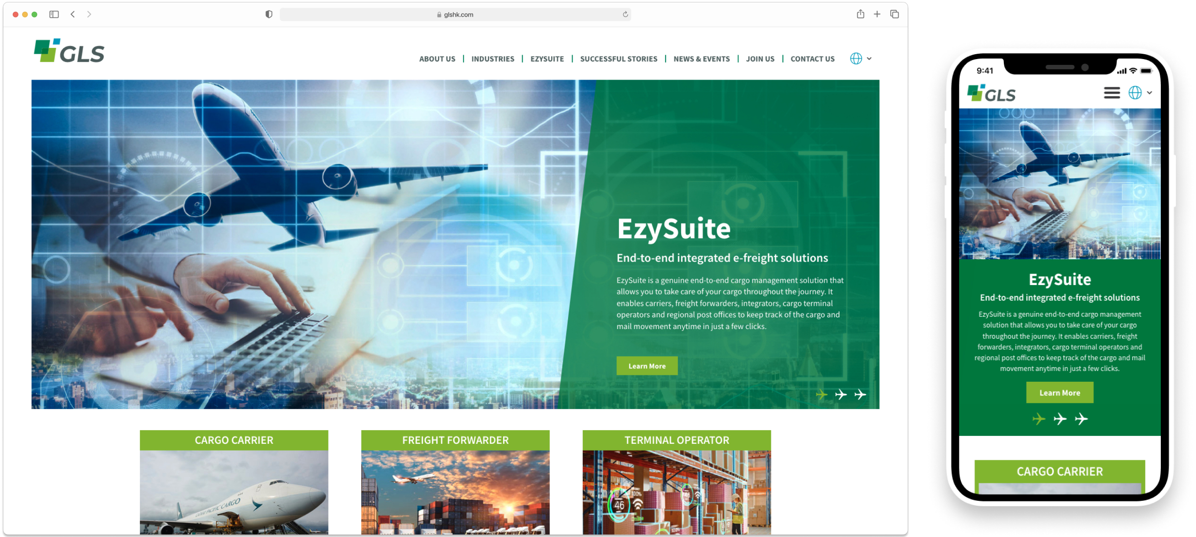
Lack of Responsive:
Most of GLSHK products' web portal, they only show 1:1 screen size and the content are hardly to read.
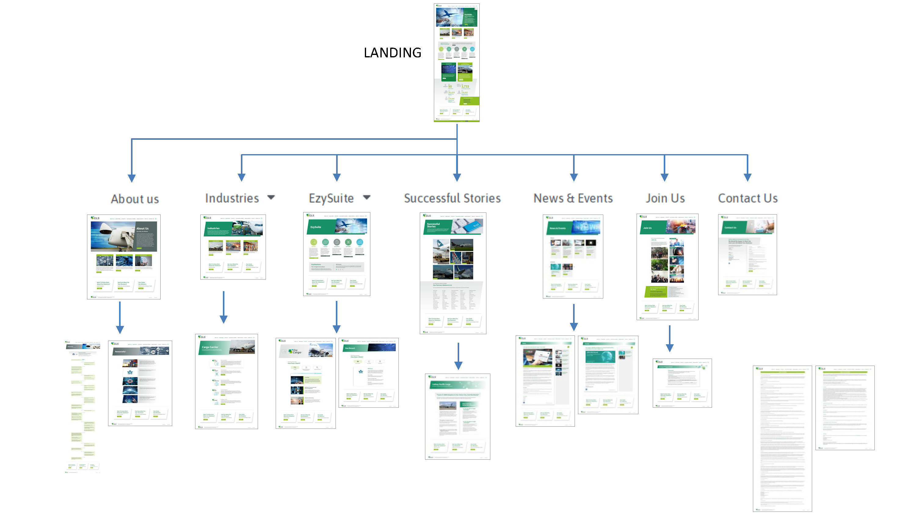
Information Architecture for better organize:
To help me a better presentation, I created IA to help me to comparison and organization.
Define
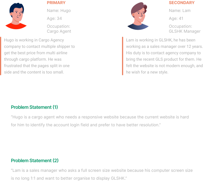
In this phase, let meet our users to see how I made the problem statement.
Meet Our Users
Design
To completed the design phase, I given my ideation in the early stages including layout, picking the images, color selection...etc.
Consistent Visual Styles
Solving the problem of “Poor use of visual”, I used consistent visual styles including color, typography and imagery. My purpose is to create a cohesive and professional look and feel.
Graceful Degradation
Using graceful degradation to approach because I started with a large screen with a lot offeatures and interactions, and it was better to work my way down toward a smaller screen.
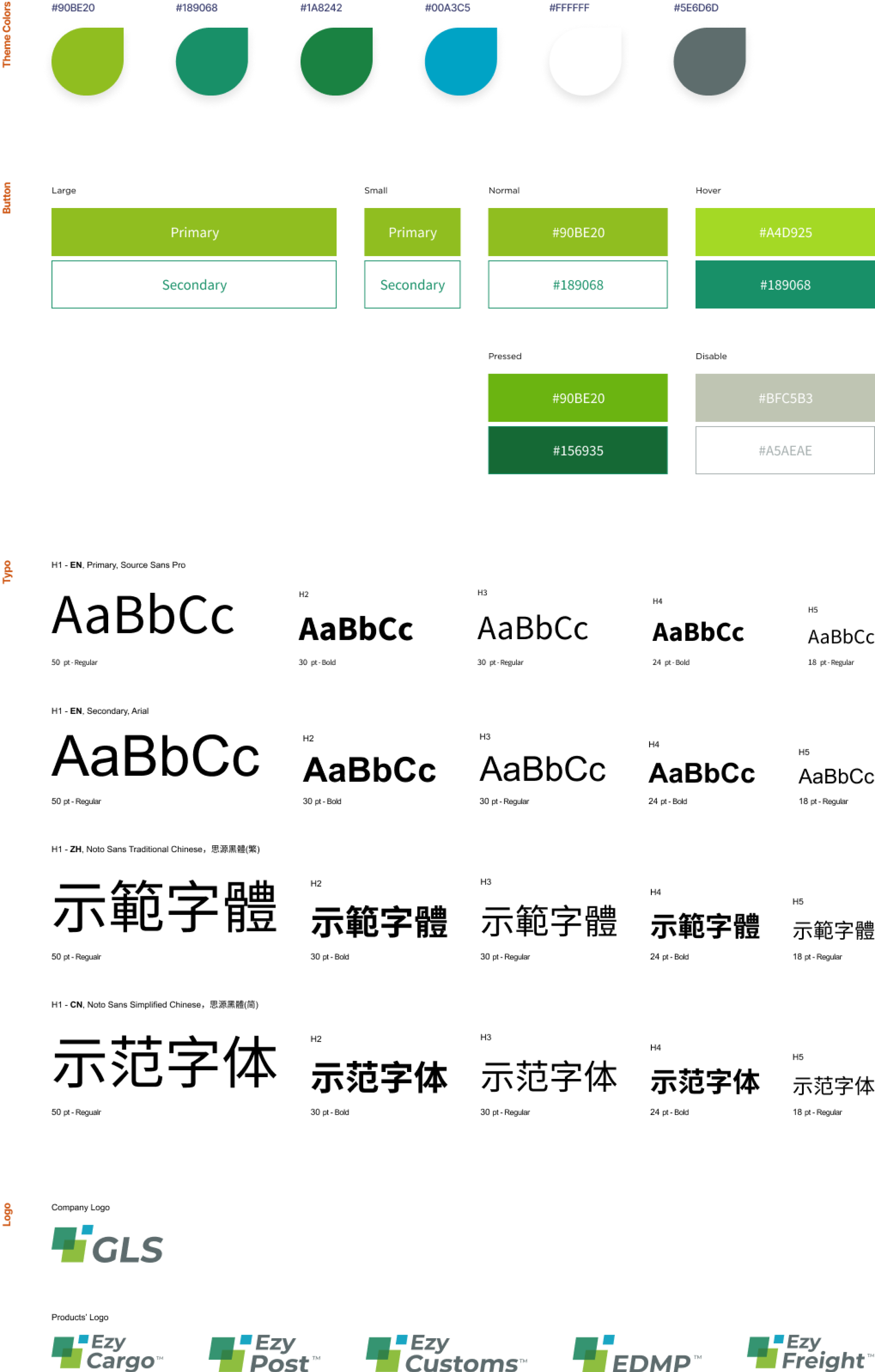
Establish clear brand guideline
To maintain a better brand consistency, I developed a clear brand guidelines. Including logo usage, typography, color palettes. Choosing green color as for GLSHK theme color, because they represent the energetic atmosphere and from bright to dimmer green those related as reliable.
Takeaway / Outcome
Overall in this project in GLSHK, my biggest takeaway was to handle ideas from management team and to convince them to choose a better version from my review. Because there were two sides of atmosphere they wanted to represent in the web (cyber & friendly), and I provided my solutions by used mood board, analysis competitors and reminding them about company’s slogan. Eventually, they compromise and selected my idea of cyber & efficiency. At last, in August 2022 after implement and tested out. The completed display in both responsive corporate web and products’ web portal was launched.